From core to complete: unlocking the full potential of a sleep robot

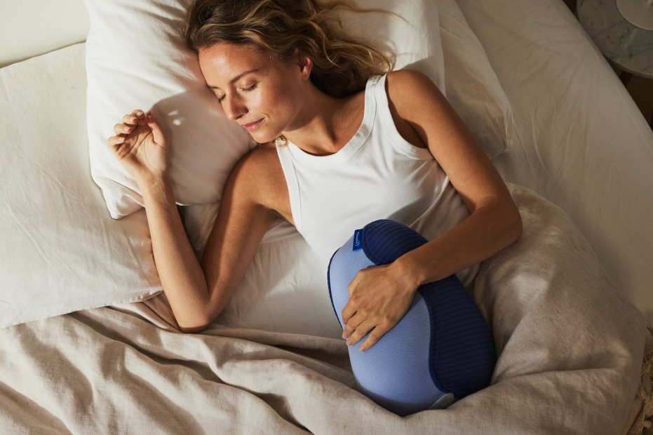
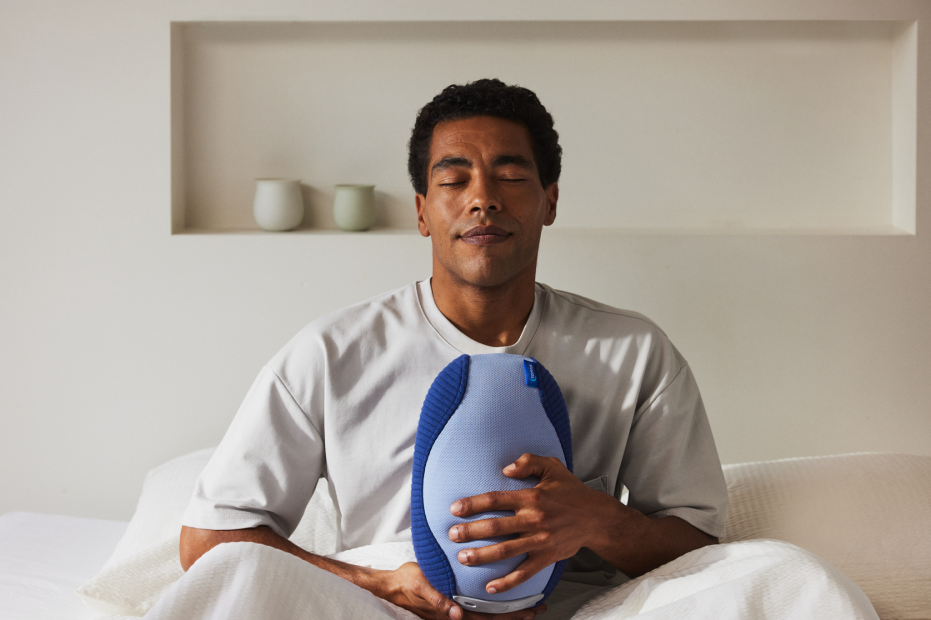
Millions of people struggle to fall asleep. Somnox is a robotic pillow that mimics your breathing rhythm, slowing it down and calming your nervous system until you drift off. It was already helping thousands of users sleep better. The hardware did the work, but the companion app was how users could truly make it their own. Personalising the experience, fine-tuning the robot to their needs, unlocking everything the hardware was capable of. When we shipped, we focused on the core. My role was to take the app further and unlock the product’s full potential.

Role

2021 – 2022

Sole product designer

End-to-end ownership of Product UX

Impact

-8% reduction of product returns

4.3 / 5 rating on App store 

over 10K+ downloads

Main-image-somnox

The Gap

What the data was telling us

The product was working, but not for everyone. A significant return rate signalled that something wasn’t landing for a meaningful portion of users. Return reasons were vague. “It just didn’t work for me” appeared constantly. Rather than accepting that at face value, we treated it as a research problem. That investigation became the foundation for everything we built next.

The Research

Finding what was really going on

We started by monitoring. Tracking return reasons and App Store reviews continuously to spot patterns in how users were talking about the product.

One phrase kept appearing: “it just didn’t work for me.” Vague enough to ignore, common enough that we couldn’t. So we went deeper. Running user interviews and cold calling customers who had returned the product to understand what it actually meant.

The answer was specific. The robot produced a low-frequency vibration noise at night that was disrupting sleep rather than aiding it. Without that second layer of research, we never would have found it.

1. Monitoring

Return reasons and trustpilot reviews: tracking patterns in how users described their experience.

2. Cold Calling / Interviews

User interviews and cold calling returners: going deeper on the signals to understand the real cause.

Solution

Turning a hardware constraint into a conscious user choice

The vibration noise came from the robot’s breathing mechanism. We couldn’t change the hardware. But reducing the breathing intensity naturally produced softer movement and less noise.

The tension was real. The product worked exactly as intended for the majority of users, some of whom found the strong breathing rhythm central to the experience. Reducing it by default would have degraded something that was genuinely changing lives.

So we made it a conscious user decision instead. Rather than silently adjusting a default, we surfaced the tradeoff clearly in the app. Stronger breathing means more presence and more noise. Softer breathing means quieter nights with a subtler sensation. Users could personalise it to what worked for them, and understand why.

intensty-somnox

Hiding complexity so users never had to feel it

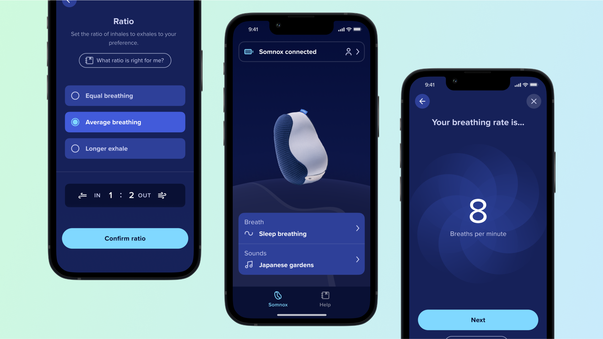
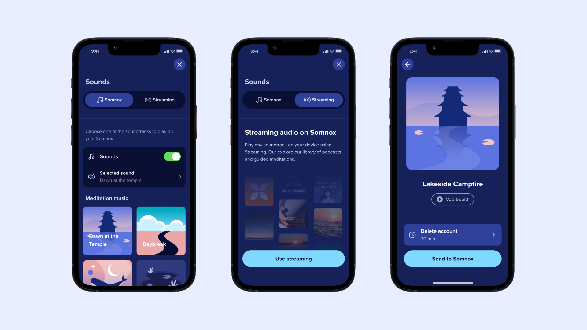
Music streaming was one of the most requested features after launch. The robot already had Bluetooth, but streaming audio from a phone required a different protocol than the one already used to control the device. In practice, users had to make two separate connections to what felt like the same device.

The temptation was to explain all of this. We did build a help flow with illustrated step-by-step guidance for users who got stuck, but that was the edge case, not the default experience.

“At the end of the day, you just listen to music.”

That principle drove the design. Once connected, a segmented control let users switch freely between playback modes with no awareness of the technical difference underneath. The complexity was real. The user never had to feel it.

music-somnox
Frame 727

Bringing the app in line with a maturing product

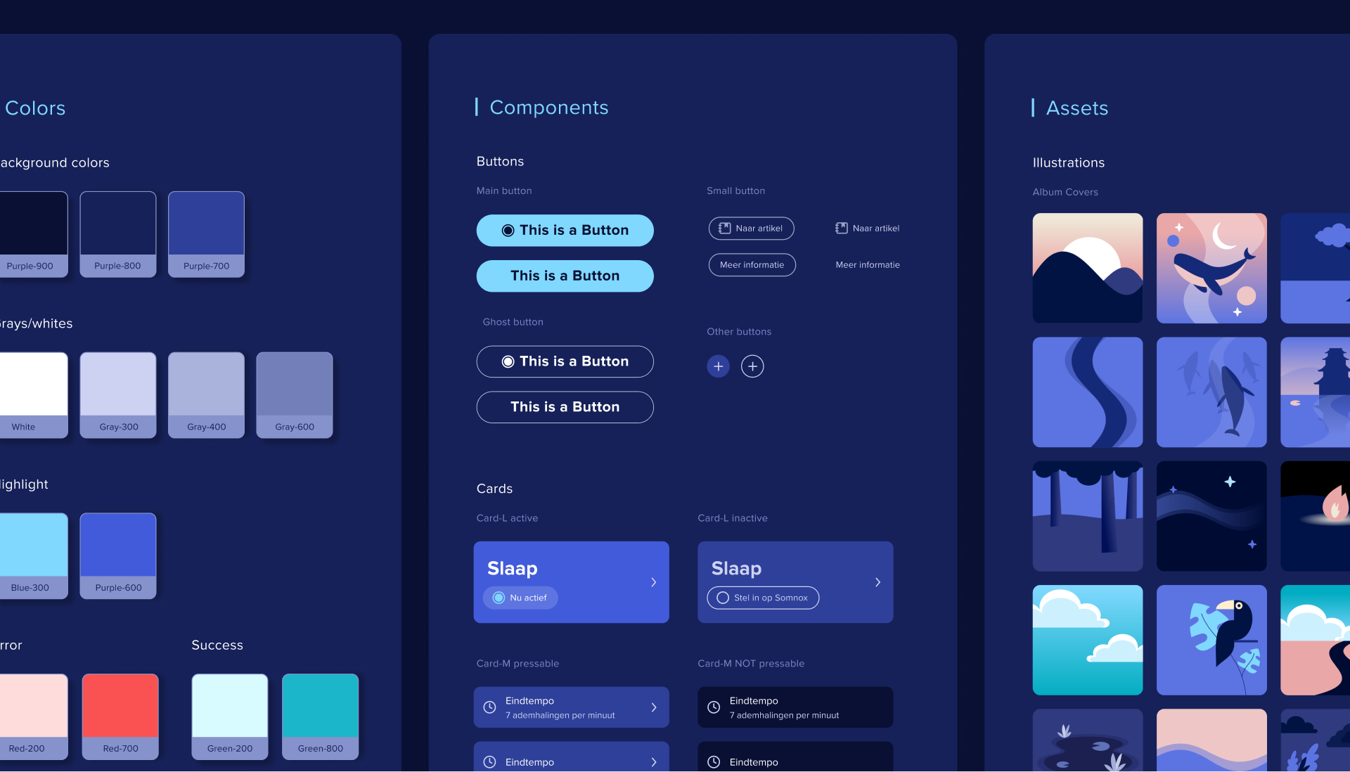
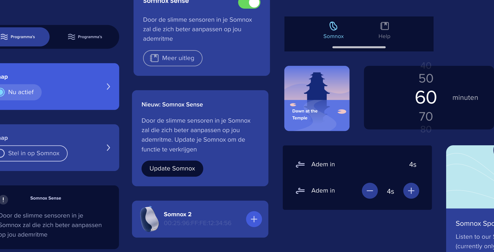
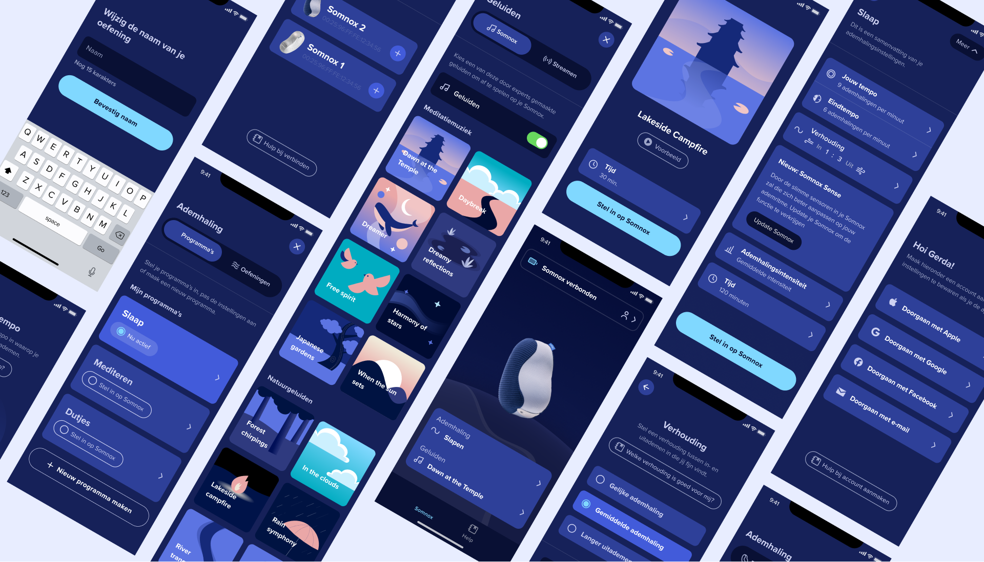
As Somnox evolved beyond its MVP, the app’s visual language needed to catch up. I led a full visual overhaul. Updating the colour system, bringing typographic consistency across screens, and aligning the UI with Somnox’s refreshed brand identity.

Alongside the rebrand, I introduced WCAG accessibility standards throughout. For a product used in low-light conditions by people who are tired, this wasn’t a compliance checkbox. It was fundamental to making the product work for the people using it.

Frame-523
somnox-screens

Trust me, I’m a designer © Bryan Yip