
Redesigning Marktplaats Zakelijk
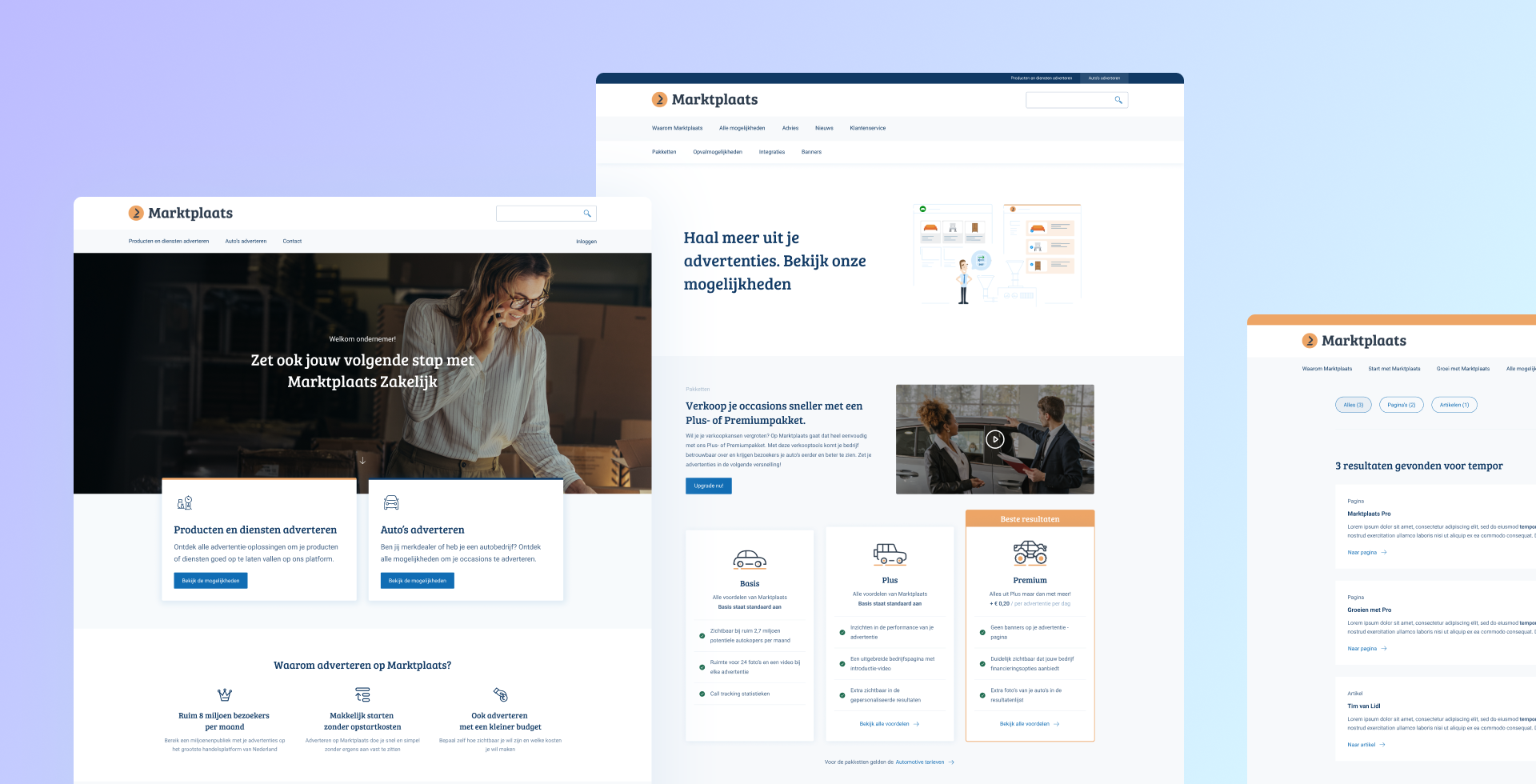
Live product
Marktplaats is the biggest online selling platform in the Netherlands. They asked Hike One to redesign their website for Marktplaats Zakelijk, their platform for business users.
I represented Hike One at Marktplaats and was in charge of leading the design process. The project took 4 months, and we launched the new product in July 2023.
Challenge
According to the analytics data, the Marktplaats Zakelijk website had a low sign-up conversion rate. The design project aimed to improve user experience and increase the conversion rate.
Marktplaats zakelijk offers various services to different users, and each service is managed by multiple departments. Due to this, a lot of stakeholders were involved in the project, which required us to manage their interests and inputs carefully.
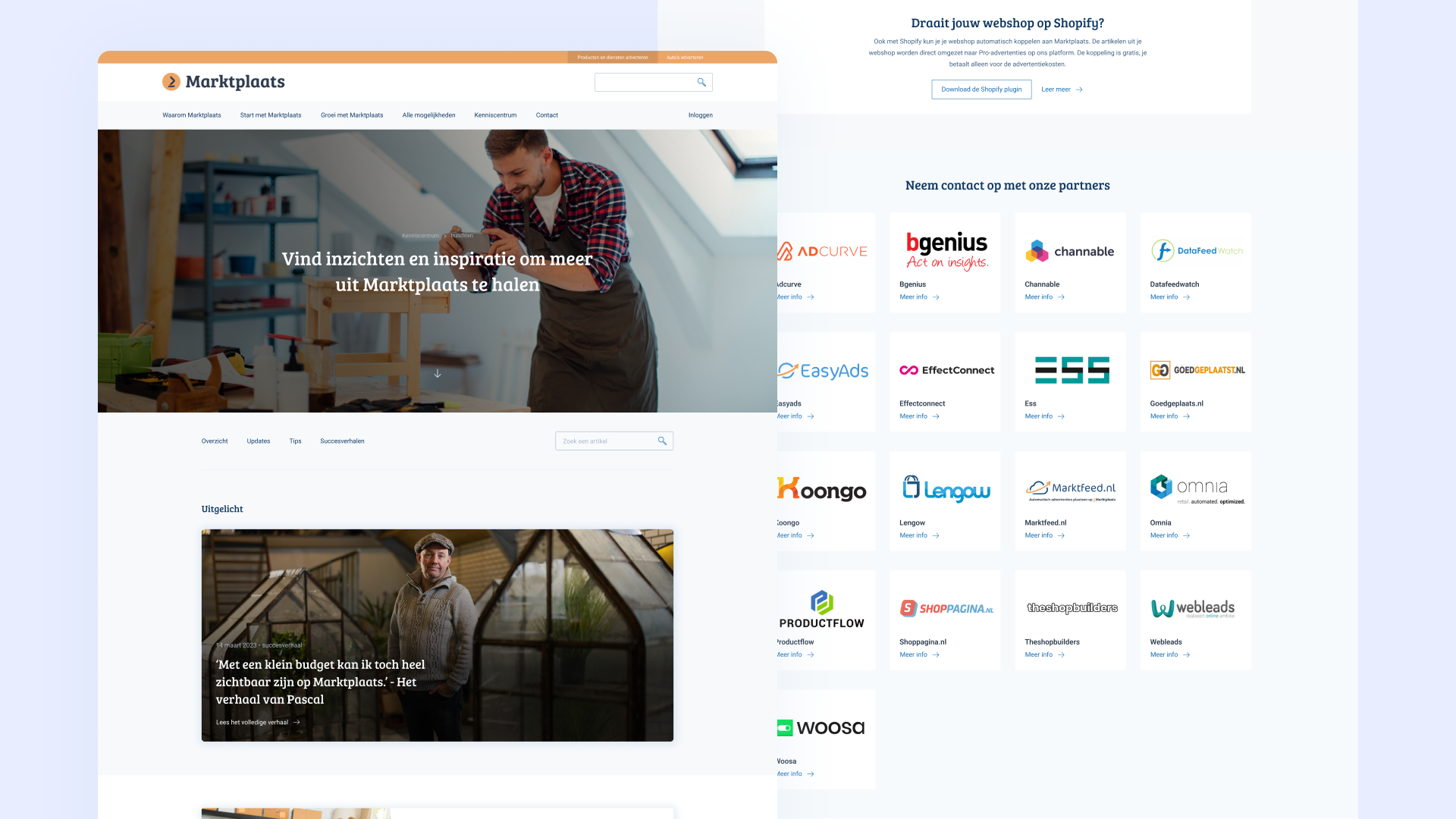
Outcome
We designed a new website with an improved information architecture, making it easier for users to find the right services they need. We made sure to highlight the value of each service clearly to users. We also addressed general usability concerns, such as improving the visual hierarchy and making it easier for users to scan and comprehend the content.

Understanding the problem
To understand the problem, I conducted an expert review of the website to identify potential usability problems. In addition, we analyzed existing research data and used analytics to pinpoint the reasons behind the low conversion rate. These were the key findings:
- Lack of important information:
The website lacked essential details such as pricing and examples of their services. As a result, users were left unsure if the services would fit their needs well. - No clear starting point for the user:
Marktplaats Zakelijk provides different services that cater to different customer groups. However, the previous website didn’t specify which service was intended for which customer group. It wasn’t clear for the user which service was suitable for them. - Headers and labels with low information scent:
The labels and headers used on the website were not descriptive enough. Many menu labels utilized company jargon, making it difficult for users to understand.
Aligning the stakeholders
Our next task was identifying which service was intended for which customer group. During our analysis, we observed a discrepancy among the different stakeholders.
To ensure everyone understood each service’s value proposition for the project and its intended customer segment, we held a value proposition workshop with various stakeholders. The goal was to reach a unanimous understanding for the project.

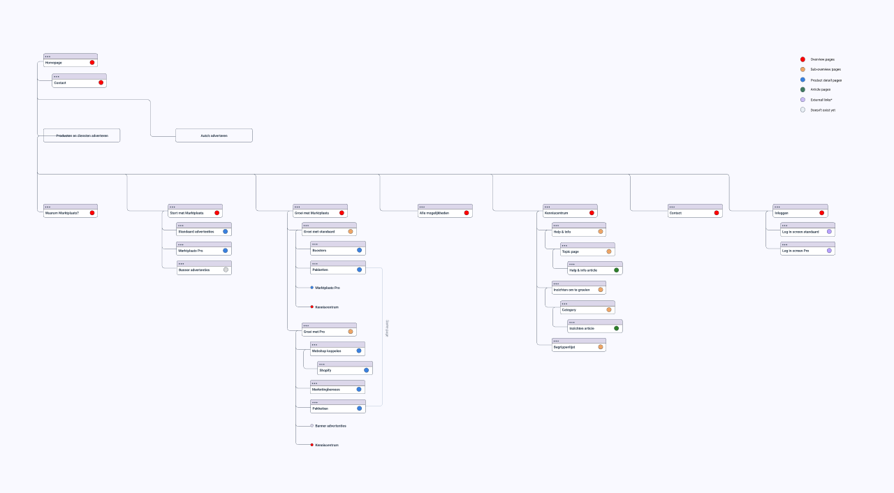
Information architecture
The workshop helped in shaping the development of our information architecture. We used the insights gained from the workshop to organize our services into distinct clusters based on our different customer groups. This approach helped us create a user-friendly website structure, which made it easier for users to find the services that were most relevant to them.
Wireframes & user testing
After receiving approval for the information architecture, we moved forward with translating it into wireframes and tested these with potential customers.

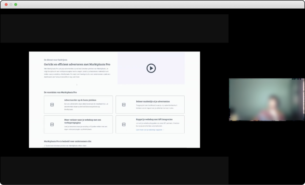
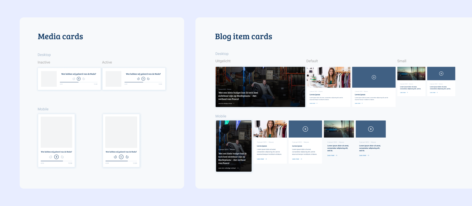
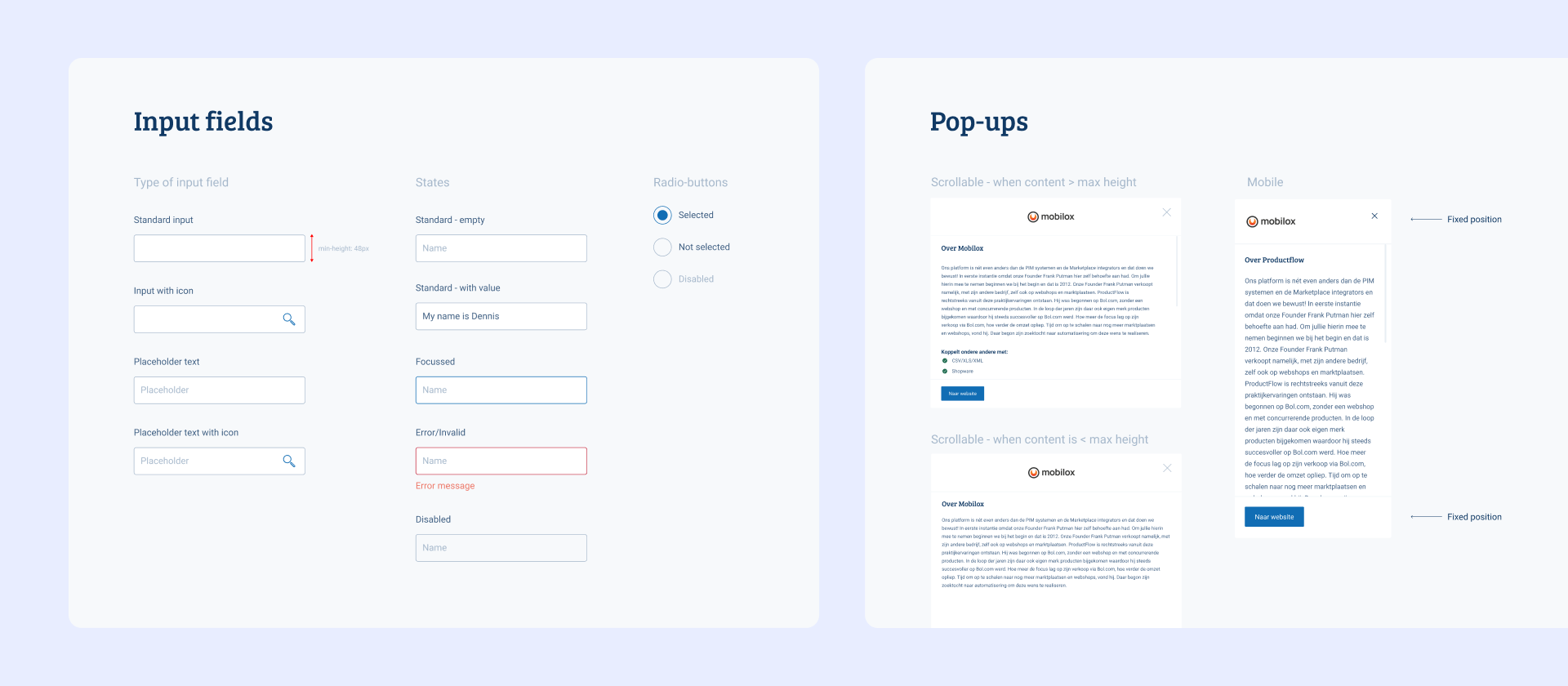
Designing components
We formalized the components and added a visual design layer on top of the wireframes. These were then handed over to the development team.
Key improvements
We made some key improvements to the website’s architecture.
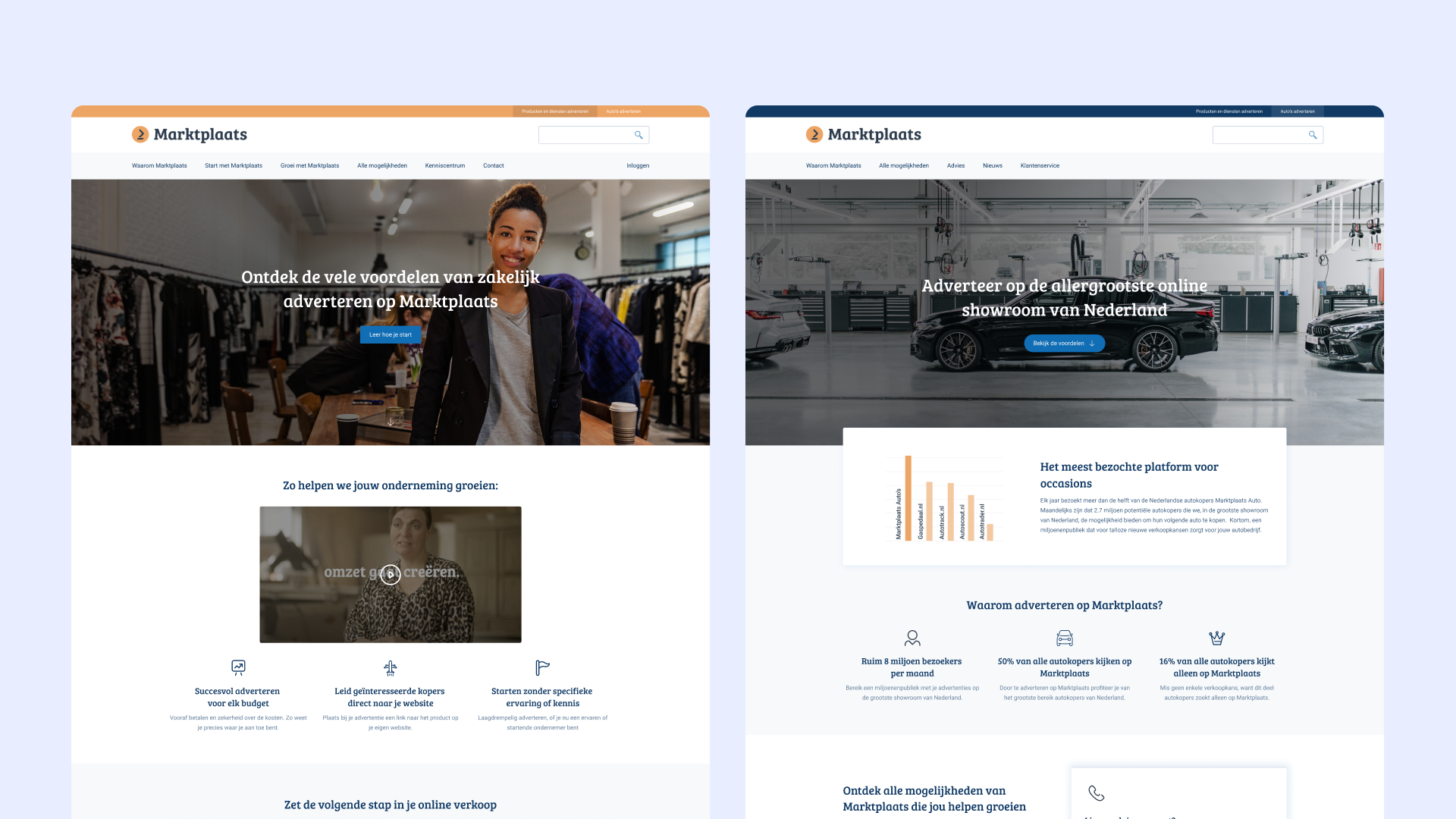
We split the website into two sections for car dealers and regular business users to cater to their distinct information requirements. This makes it easier to manage the website, as each department can now handle their section independently.
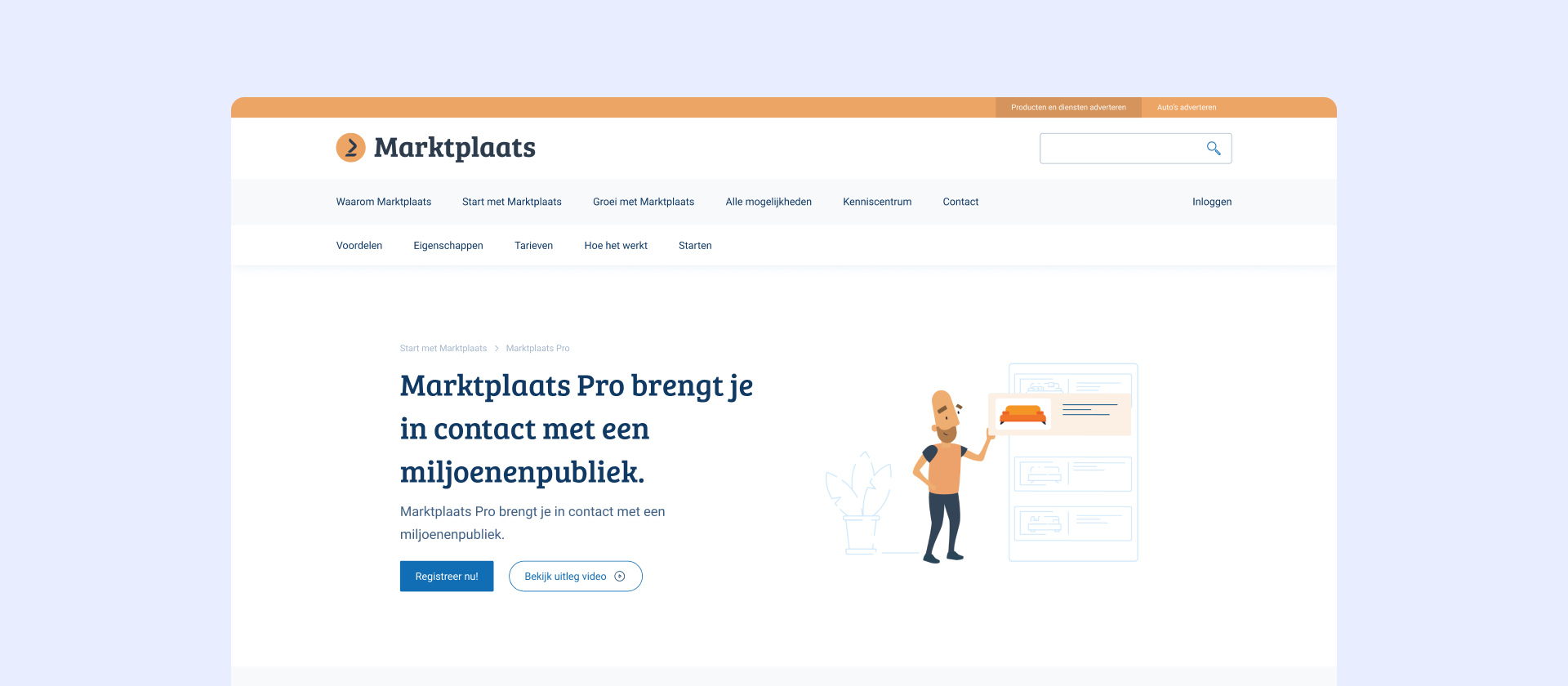
In addition, we have included a detailed page for each service, which provides users with essential information, including pricing, features, and most importantly: examples.
To make navigation more user-friendly, we have also added a local navigation menu to help users move around the page with ease.
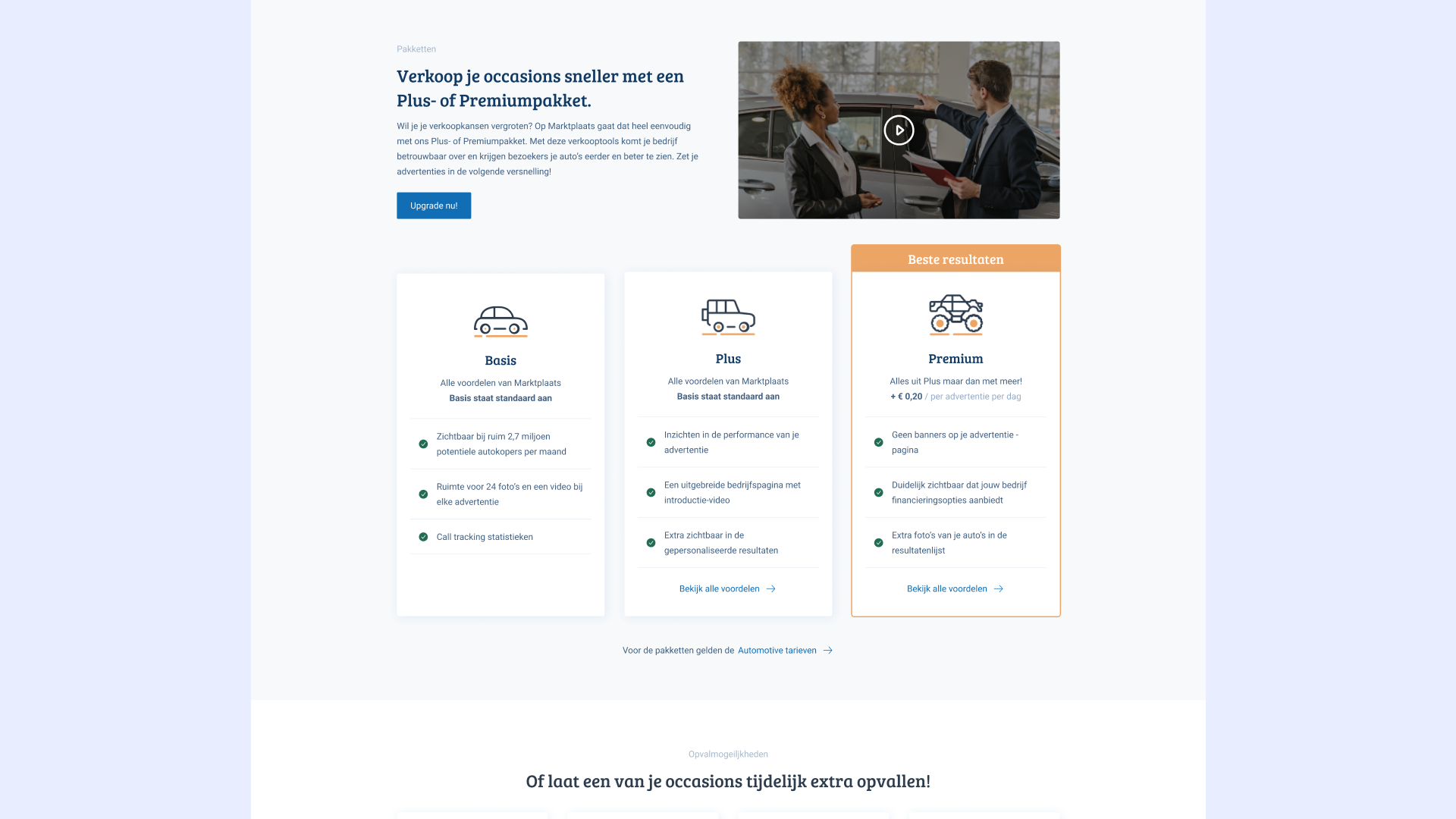
We also added comparison tables for similar product offerings so users can easily compare features to make a final decision.
Within the budget, time, and company constraints, we have successfully created a user-friendly website for our target audience. Our goal is to increase the conversion rate. Another agency was responsible for the development of the product. The website is currently live and being used by thousands of daily-users.