
ING: Making mobile banking more accessible
Conceptual product / Research
Mobile banking can be a difficult task for people with visual impairment. Together with ING and Visio (center of expertise for visual impairment), we improved the mobile banking flow of the ING app for this target group. We conducted in-depth user research and designed a concept to make mobile banking feel more secure and seamless for people with visual impairment.
This project has been listed as The Best Banking & Finance Designs 2024 by DesignRush
Quick iterations while receiving in-depth user insights
The time scope of the project was 4 weeks. The short time scope required a different design approach to ensure an optimal result. Together with Visio, we set up a team consisting of several experts and people with visual impairment. We organized regular ideation, discussion, and review sessions. This approach allowed us to iterate fast while receiving in-depth user insights to ensure a genuinely workable solution.
Cognitive walkthroughs
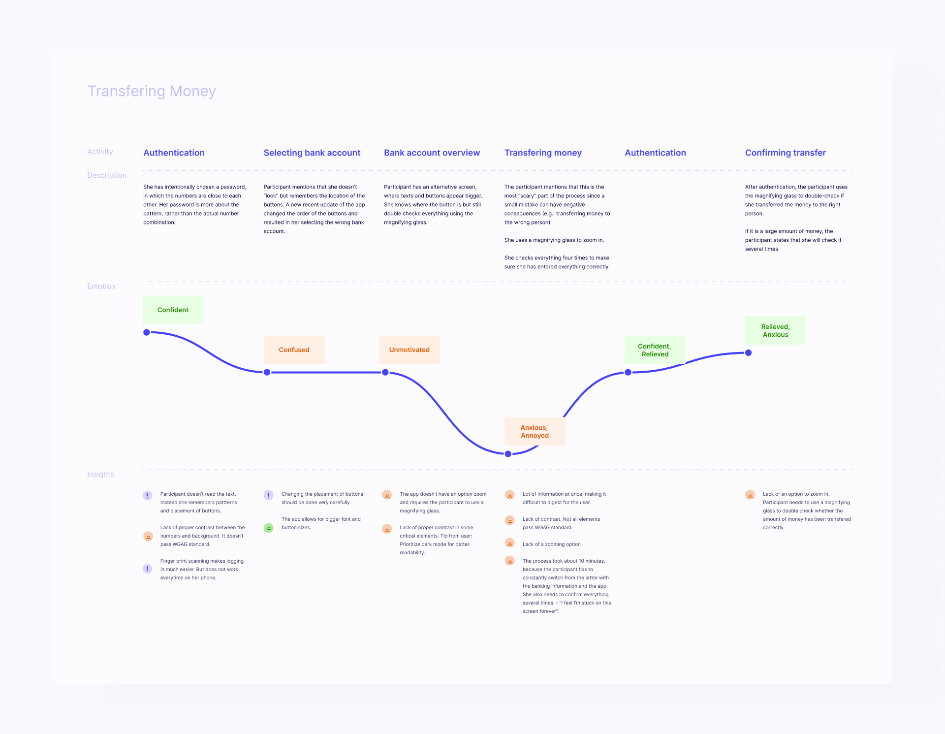
One of the first things we did was to conduct cognitive walkthroughs with our target group to evaluate the experience of the current ING-banking app. This walkthrough allowed us to identify pain points and opportunities throughout the mobile banking journey.
Key findings
- Participants required external tools to complete the task
The app doesn’t allow for zooming in, which causes difficulties for people with visual impairment. Most participants used external tools such as a magnifying glass or an extra phone (using their camera) to zoom in. - Filling in banking information was the biggest pain point
Filing in banking information was the biggest pain point throughout the journey. In this step, users have to fill in critical information such as the transfer amount and banking account number. A slight mistake can have serious consequences, such as transferring money to the wrong account. Our participants already doubted their sight, which made this step even more frightening. - “Don’t treat us differently when aiming for inclusivity”
When designing for inclusivity for a particular target group, companies often create an alternative solution (e.g., an additional visual impairment mode in an app). However, in our discussions, we found that these solutions don’t feel inclusive. – “Don’t treat us differently when you are aiming for inclusivity.” – is the feedback we received from our team of experts. This created a vision for our project: the design should be a general redesign of the app that would benefit people without visual impairment as well.
Making the information graspable
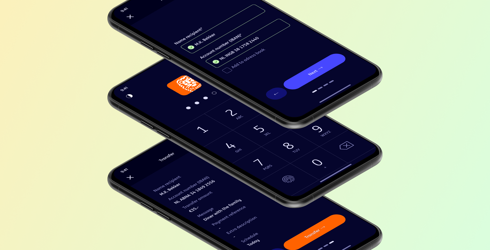
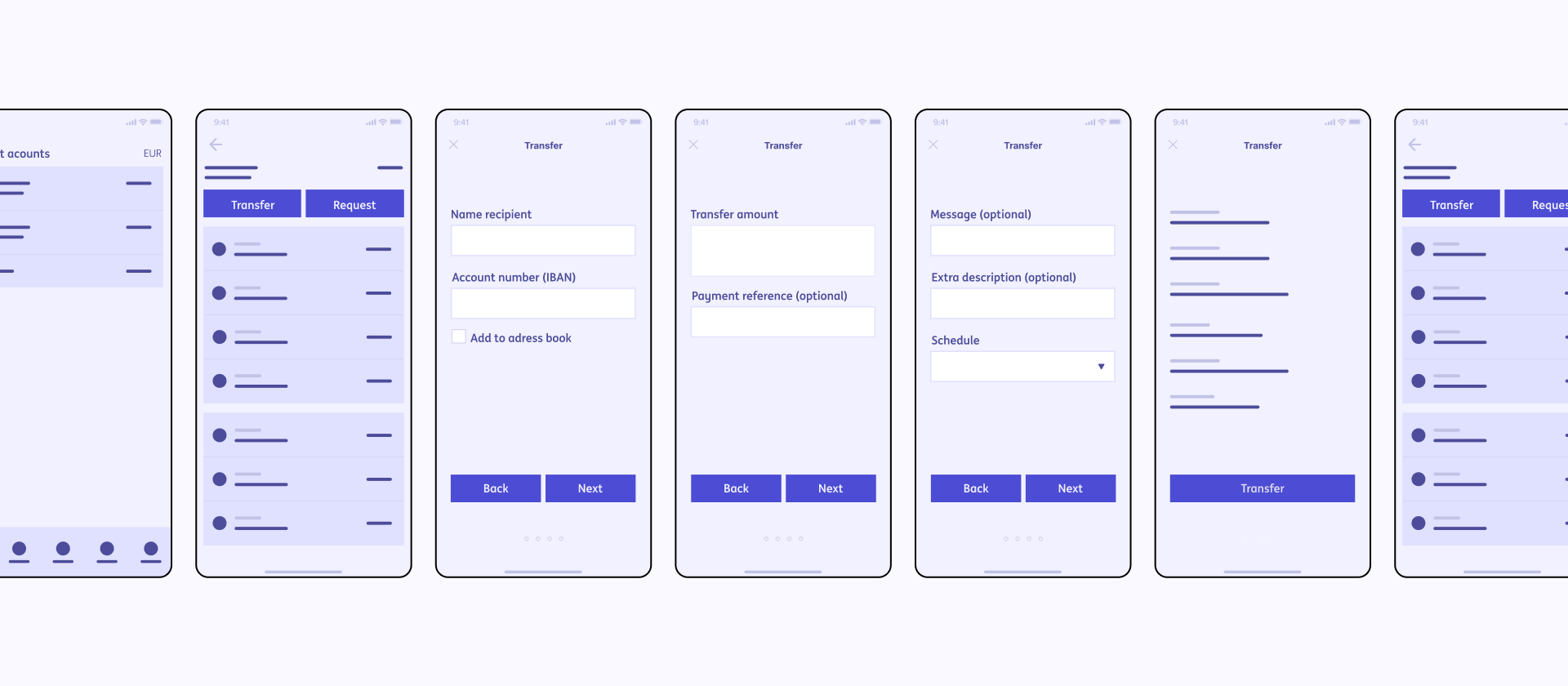
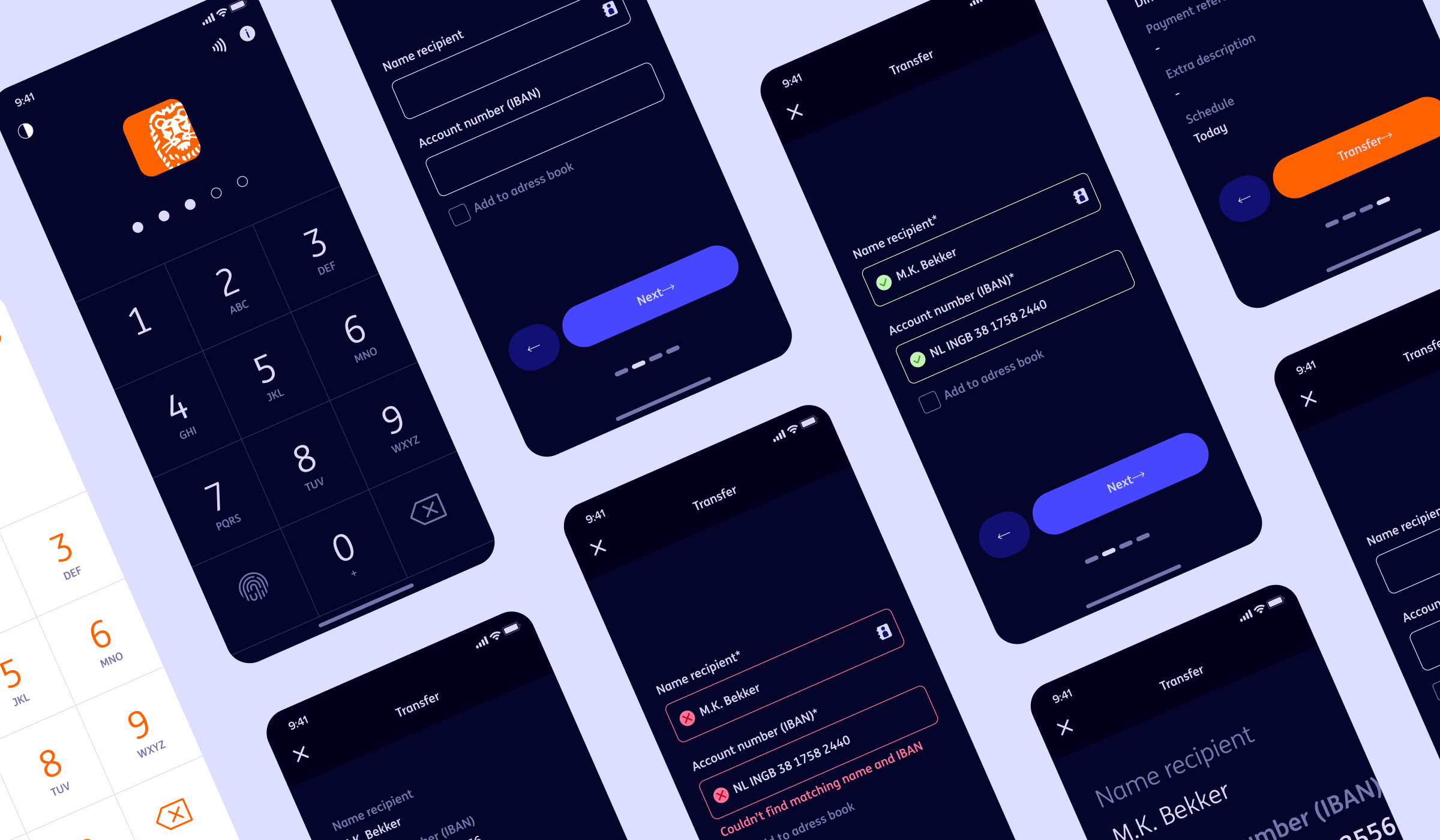
The main changes were made when users had to fill in the banking information since this was considered the biggest hurdle. The current ING app has one screen where the user has to fill in all the banking information. In our redesign, we split it up into 4 different screens, each targeting a piece of specific information that needs to be filled in to avoid visual overload.

A seamless journey without external tools
We also allowed zooming in for each screen, so our users do not require external tools, making the experience more seamless.
Many participants used dark mode as default since it makes the screen more readable. We optimized its dark mode interface and make sure that all critical elements had enough contrast.

Team: Bryan Yip, Felix Fraile Schumacher, Ane de la Brena Garcia